I request a signature, I'm willing to pay 20 million credits for the job, so I expect something good, da!
The style and color theme should reflect Russian (preferably Soviet) culture.
Suggested Colors: Red (Light and Dark) with Gold.
IMPORTANT: Do NOT add the Soviet Sickle and Hammer logo on the signature. Even though I requested Russian/Soviet culture & style.
You can of course pick your own color theme if you want, and totally surprise me.
The size must be: 600px x 200px (See size reference on old SCRA signature)
The name: Zarevo Kaputski MUST be on the signature. Here I want a Russian style font but the letters should be English(?), not sure how to explain this properly, just take a look at my name from my former signature and you will understand what I mean.
Remember! No SCRA tag or rank on my name. Color of the name should be in Black if you choose to go with the Red/Gold background.
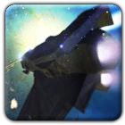
One of these three pictures MUST be included in the signature. You can choose one that fits the best, however, my favorite is picture number 1.
1.
2.
3.
If you want some inspiration on the background color and style, here is my former signature made by Yue Fei:
' Wrote:...Here I want a Russian style font but the letters should be English(?), not sure how to explain this properly, just take a look at my name from my former signature and you will understand what I mean...
Greetings man. I tried to follow all you said. I hope you like it.
Took me a while to make it. I decided to add that Saint`s Basil Cathedral from Moscow.
It is a known church from Russia. (you said culture etc...)
I also like the color scheme you have chosen. And the position of the picture is well placed, however, the picture of him needs to "blend" in a little more with the background. Right now there is too much contrast.
Also, could you please remove the "add-on effects" marked with red.
Please repost the signature once you completed these two tasks, and we will see how we go from there.
As you can see on my other signature, I like it very simple. You don't need to have effects everywhere:P
Removed the effects marked in red. I tried to blend him a bit into the background. I could dark more the orange at the right of the picture...and bottom.
![[Image: Kirill1.jpg]](http://i298.photobucket.com/albums/mm257/Zeltak1990/Kirill1.jpg)
![[Image: Kirill22.jpg]](http://i298.photobucket.com/albums/mm257/Zeltak1990/Kirill22.jpg)
![[Image: Kiril34-1.jpg]](http://i298.photobucket.com/albums/mm257/Zeltak1990/Kiril34-1.jpg)
![[Image: SCRASignature.png]](http://i298.photobucket.com/albums/mm257/Zeltak1990/SCRASignature.png)

![[Image: ZarevoKaputskibyinternitycopy.png]](http://i90.photobucket.com/albums/k247/RS-21/ZarevoKaputskibyinternitycopy.png)
![[Image: ZarevoKaputskibyinternitycopy.png]](http://i298.photobucket.com/albums/mm257/Zeltak1990/ZarevoKaputskibyinternitycopy.png)
![[Image: ZarevoKaputskibyinternity2.png]](http://i90.photobucket.com/albums/k247/RS-21/ZarevoKaputskibyinternity2.png)
![[Image: ZarevoKaputskibyinternity2.png]](http://i298.photobucket.com/albums/mm257/Zeltak1990/ZarevoKaputskibyinternity2.png)
![[Image: ZarevoKaputskibyinternity3.png]](http://i90.photobucket.com/albums/k247/RS-21/Poze%20Mari/ZarevoKaputskibyinternity3.png)
![[Image: Givecash.jpg]](http://i298.photobucket.com/albums/mm257/Zeltak1990/Givecash.jpg)