Alright I spent some time on Photoshop (which I'm a noob at btw)
I've got three choices. They are all the same sig, but with a text change. The background is kind of blurry, but thats because I had to double the pic's size, which made it really pixelated. It was either a lot of pixelation, or slight blurriness.
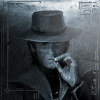
The first is the one already in my sig;
Its got a grey text for Val'ren with some slight outer, and more inner, shadowing of very dark red. It blends in pretty well but is still viewable without standing right out.
The second one;
The text stands out much more than the other one. Its dark red with black inner-shadow and a very small outer shadow. Its also got a thin green glow around it. It adds color, which this pic lacks.
The third;
Its simply the sig with no text at all. I'm not to keen on this one, as I want Val'ren's name in the sig.
So comments anyone? I don't know if I want to use 1 or 2 yet.
To be honest, I really like these sigs. They're abstract, yet still have a concrete image.
I personally like the first one the most, the other wording seems to stand out a little bit much. Like you said, though, the second one adds color but I tend to be a less artistic, more black and white person.
Hype
Retired A very big thanks to Dark Oddity who put my signature pic together
I'm all about #1. I know #2 adds color, but I don't think the green really fits in with the theme.
I also like the off center placement of the text in #1, but I think it leaves a bit of a hole in the bottom center that just doesn't feel right to me. Is there anything that might fit in there?
Also, I think the sword emblem on the right might look better a little more toward the lower right if you are going to keep the text toward the top. I think it will help balance the whole picture.
I don't really want to move that icon, so I tried thinking of another way to fill in some empty space. Came up with an idea, and took the full version and sort of a half-version of it.
First;
Planet that is fading into the background (BTW Dboy, I found something more useful for making it fade to black than using gradient. Message me on Skype tomorrow), and a beam that fades in is hitting it. There is an explosion, where leftover energy bounces back out, and blown-out ground is thrown up and around the planet. I'm not too good with beams and the like yet, haven't done this long enough for that, so it doesn't look all that great, plus the bright color doesn't fit in too well. If you think of any other colors that could replace the beam and make it fit in better, I'm all ears. Personally I think the beam just sort of overdoes it. The beam is still under construction. Mostly in the explosion area. I haven't yet shown the explosion going over the planet, as that requires alot of fine editing so that the surface is still viewable and recognizable. And the explosions going out to the side will be worked on, as they are not going in quite the right directions, but some are somewhat illogical.
Second;
This one also has the same planet, but I removed the beam and moved the planet up much higher so its right under the text. Its still fading into the background, but there is no explosion or beam to take away from the general theme and color of the pic. If it looks better for the pic to be off-balance, I could move the planet down and right, or down and left, though I think down and right would look better.
Yeah, I'm working on getting some more font types. When I made this, that was my best looking font. When I find a good one I replace the font and post another pic.
I found two good fonts, but they don't work well with the shadowing, striking, and glowing tools. Didn't turn out well at all, so the latest one is still the best. Don't know whether I should go with or without the planet, or to move the planet though.
I'll try working more on the fonts tomorrow and see if I can find a setup for them that comes at decently.
I like the idea that you're bringing out in this sig. If you send me the unedited pics and give me an indication or an idea of what you want to be done, I could help... given the opportunity, of course ??


![[Image: SignaturewithFigureandLogoandTextGr.png]](http://i22.photobucket.com/albums/b328/Luciaden/SignaturewithFigureandLogoandTextGr.png)
![[Image: SignaturewithFigureandLogoandText.png]](http://i22.photobucket.com/albums/b328/Luciaden/SignaturewithFigureandLogoandText.png)
![[Image: SignaturewithFigureandLogo.png]](http://i22.photobucket.com/albums/b328/Luciaden/SignaturewithFigureandLogo.png)
![[Image: DFinal.png]](http://i22.photobucket.com/albums/b328/Luciaden/DFinal.png)
![[Image: 2001775094275025807_rs.jpg]](http://aycu11.webshots.com/image/4250/2001775094275025807_rs.jpg)
![[Image: 771179322673kj2.png]](http://img508.imageshack.us/img508/859/771179322673kj2.png)

![[Image: harlcopy.png]](http://i102.photobucket.com/albums/m117/mhisteal/harlcopy.png)

![[Image: SignaturewithFigureLogoTextGreyandB.png]](http://i22.photobucket.com/albums/b328/Luciaden/SignaturewithFigureLogoTextGreyandB.png)
![[Image: SignaturewithFigureLogoTextGreyandP.png]](http://i22.photobucket.com/albums/b328/Luciaden/SignaturewithFigureLogoTextGreyandP.png)
![[Image: GlossyNew2copy-1.png]](http://i195.photobucket.com/albums/z57/dopamino/GlossyNew2copy-1.png)

![[Image: graphicalqv7.png]](http://img515.imageshack.us/img515/6471/graphicalqv7.png)
![[Image: sigot0.png]](http://img509.imageshack.us/img509/5568/sigot0.png)
![[Image: userbarwy6.jpg]](http://img502.imageshack.us/img502/2081/userbarwy6.jpg)