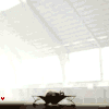
ok - here is a first Concept - its sinister enough - but its hard to recognize the ship, visible that it is a ship/capship even - but not what ship....
by the way - that is the "classical" variant - instead of a sci fi high tech design...
oh - and i wasn t sure about what font to use - so this one is only a placeholder
just a concept - since the threat is over 1 month old - and i haven t seen anything ... it has to start somewhere:)- yes, its dark - but thats no problem.... 2 or 3 clicks in photoshop brightens it all up, if needed. its more about the composition right now - and the style in general ... that means, if he likes something classical or hightech looking.
(above: Classical, rather dark with the bloody monstar writing and an elegant script as opposed to that)
(above: a rather "high tech" variant with an explosion in the middle, the ship close by and the portrait. added some distortion - but i could remove those if you don t like them)
personally, i like the classical more, the other one isn t dark at all - when there is some bright explosion - its hard to make things dark/sinister - but you can identify the ship much better there - added some debris to the explosion so that it fits into the scene better.
i was looking for some exploding ship pics or ship wreck pics to add to mine...those along with the exploding planet would've been nice. that's the look i was going for on mine, his ship flying through the wreckage of numerous ships while the planet dies in the back ground. i'm thinking of using the front looking face also. that is if i can get time away to do it.
i do really like the mirrored version except for the western text. not too fond of it. i downloaded a bunch of those scary fonts. hard to believe how many are out there.

![[Image: MonStar.jpg]](http://i216.photobucket.com/albums/cc79/JinxTT/MonStar.jpg)
![[Image: just_a_signature_by_sjrarj-d63yjsx.png]](https://img00.deviantart.net/ca73/i/2013/123/e/a/just_a_signature_by_sjrarj-d63yjsx.png)
![[Image: GlossyNew2copy-1.png]](http://i195.photobucket.com/albums/z57/dopamino/GlossyNew2copy-1.png)
![[Image: MonStarscript.jpg]](http://i216.photobucket.com/albums/cc79/JinxTT/MonStarscript.jpg)
![[Image: MonStar2-1.jpg]](http://i216.photobucket.com/albums/cc79/JinxTT/MonStar2-1.jpg)
![[Image: MonStar.png]](http://i195.photobucket.com/albums/z57/dopamino/MonStar.png)