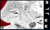
I was fiddling around when I was bored (*sigh* Summer...) and I need help... I've got a basic concept down, I just have no idea how to balance this, while still making it not look empty.
Here's the core that I wanna use.
Here's the preffered text balance, I just couldn't fit somebody on the left without covering the text in the first one.
I like you layout (and by no stretch of the imagination am I good at this) but from what I see, your renders arnt blending well enough. Their colors are too far from the color of teh main scheme of things. The ship in your sketch looks good, but the fact that it is just that, a sketch, makes it look out of place compared to the pretty finish on teh rest of the sig. And as far as your little man, the sepia color of him dosent fit, try something blue, dark blue. And again he looks somewhat hand-drawn, try to find something more finished and shiny.
But if you wish dont listen to me, I find that im a much better critic than artist myself. hehe, the "Simon" of sig-making.
Some say that he is allergic to a fungus found only between the toes of Corsairs,
and that he is oblivious to 98% of Liberty Law. All we know is... He's called the Busdriver!
First thing when I saw this that came to my mind was "?"
I don't get the concept at all... it's not very aesthetic. There's a sketch on the right. A weird alien in the middle barely visible. The word "avatar" is written in a spooky-style font of some sort. At the left, a person in... gladiator armor?
The scheme doesn't make sense really, the colors are bordering the mismatching (especially the first one)
Come on Xi-.... Yue... he needs help and tips, not just for someone to tell him he's wrong. Help teh underdogs or we'll vote to close down your monopoly on sigs.
Some say that he is allergic to a fungus found only between the toes of Corsairs,
and that he is oblivious to 98% of Liberty Law. All we know is... He's called the Busdriver!
' Wrote:I like you layout (and by no stretch of the imagination am I good at this) but from what I see, your renders arnt blending well enough. Their colors are too far from the color of teh main scheme of things. The ship in your sketch looks good, but the fact that it is just that, a sketch, makes it look out of place compared to the pretty finish on teh rest of the sig. And as far as your little man, the sepia color of him dosent fit, try something blue, dark blue. And again he looks somewhat hand-drawn, try to find something more finished and shiny.
But if you wish dont listen to me, I find that im a much better critic than artist myself. hehe, the "Simon" of sig-making.
I think i see what he wanted, do you think this ^ sounds about right? Your much better at this kinda thing than me.
Some say that he is allergic to a fungus found only between the toes of Corsairs,
and that he is oblivious to 98% of Liberty Law. All we know is... He's called the Busdriver!
Yue Wrote:Well, I'd help, but it's not very easy when I don't quite understand what he wanted to do in the first place...
Me Wrote:I just have no idea how to balance this
:dry:
Anywho, thanks, Jazz. I just made the core (which I liked) and started decorating it with stuff. i.e. No inspiration.
I'll look for some fancy renders and matching color scheme whatnot.
Usually my stuff is better, I was just lacking in entertainment on a summer day and had no ideas to go off of, much less the resources for finding renders and the like. If you want, search Magoo's Signature Commission, I'm sure its buried somewhere. It has the ghosts of my past.
Very fuuny, and i know you arnt, there would be better work, and facial reconstruction. As for what you have here im not sure, where is teh fur? convieniently everywhere put hands feet chest and face? I think the fur should cover chest too, would be more realistic, if not her face. And since you are obviously going for primate you dont need to worry about ears sooo.... looks good! Though not my style.
Some say that he is allergic to a fungus found only between the toes of Corsairs,
and that he is oblivious to 98% of Liberty Law. All we know is... He's called the Busdriver!

![[Image: JazzNewSiggycopy.png]](http://i255.photobucket.com/albums/hh154/necooley/JazzNewSiggycopy.png)
![[Image: audrey03a.png]](http://img714.imageshack.us/img714/7610/audrey03a.png)

![[Image: harlequincopy.png]](http://i210.photobucket.com/albums/bb305/Dlunar/harlequincopy.png)

![[Image: GhostSleip.png]](http://i281.photobucket.com/albums/kk206/gabelzahnmoos/My%20Signatures/GhostSleip.png)