As for your sig, I think the contrast on the Dreadnought helps a little, actually. It's not a big improvement, but I like it a little better. I also recommend darkening the Liberty logo on the front of the ship a little- it tends not to show very prominently in renders (or so I've been told) and might look better with a bit more flair to it.
The logo isn't really supposed to stand out. I put the ship in because I like the way it looks and I had a decent screenshot on hand, but my goal isn't to emphasize the insignia, so... Yeah. I think I'll use the contrasted one though, now that you've mentioned it.
(You still have that quote in your sig? Lul. I used the same word twice in the same number of sentences. Kill me >.>)
(Also, the bunny was an easy thing to render. Don't mention it.)
THEY TOLD ME I COULD BE ANYTHING SO I BECAME A SIGNATURE PLS HLP
made some changes to my future sigs (fixed the colors on Toliman, added the zoner whale for Mosinger) and I'm updating my Hakase sig.
any thoughts and feedback is much appreciated. As I make these signatures, I'm learning a lot more about effects, placing and coloring. It's pretty fun and exciting. if you have any tips, please share (I use Corel Paint Shop Pro).
Next on the agenda... textures, more specifically, fabric like textures.
The signature V of Vigil's Flight.
All the rubbish asthetic details that only the truly elitist care about. (i.e. ID, Source location, etc)
A picture of the sending entity, complete with noise. i.e. Static
And a vigilante's best friend, our slogan.
What'cha think?
-Edit- The white around the soldier *cough* Carmine! *cough* isn't a poorly cut figure, it was shine on his armor before it got ran through the filter. 'Cause its definitely a render. Like, "Save to computer", thus resulting in the infinite power of transparency.
-Double Edit- Although... I think the slogan is slightly off center. Hmm.
The noise on the render is far too strong in comparison to the rest of the image's clearness and general high-quality resolution look. Perhaps if it was in a box or something to simulate the screen? Right now the static seems more than a little bit out of place.
(Other than that, looks cool. Just felt it should be said.)
THEY TOLD ME I COULD BE ANYTHING SO I BECAME A SIGNATURE PLS HLP
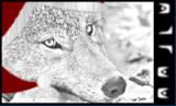
So, yes, the general arrangement of the sig seems ok - much better than your previous attempt, but, I have no idea why you overloaded your render with noise, which contrasts enormously with the rest of the otherwise very clean signature. And I can't keep but itch at the blue presence in the render that is not reflected in the black and white rest of the sig.
There is a color scheme, thank you. Neutral. Emphasis on blue. Not everything has to be monochrome.:dry:
I'm not an amateur, please, stop treating me like it. Paint.NET isn't exactly as flexible as Photoshop. Anyways... Neutral colors with an emphasis on blue. Color scheme + element of art. Marvelous.
*sigh* Thanks, Overload. You're the light at the end of the tunnel these days...

![[Image: SCRAgenderheuristics.png]](http://i530.photobucket.com/albums/dd343/sovfalcon/SCRAgenderheuristics.png)
![[Image: Aai7V.png]](http://i.imgur.com/Aai7V.png)
![[Image: audrey03a.png]](http://img714.imageshack.us/img714/7610/audrey03a.png)

![[Image: SethSig.png]](http://i130.photobucket.com/albums/p272/Sedrander/SethSig.png)

![[Image: toliman3-1.png]](http://i124.photobucket.com/albums/p29/matthias251a/toliman3-1.png)
![[Image: hakase3.png]](http://i124.photobucket.com/albums/p29/matthias251a/hakase3.png)
![[Image: mosinger-1.png]](http://i124.photobucket.com/albums/p29/matthias251a/mosinger-1.png)
![[Image: Cmdrtoliman.png]](http://i124.photobucket.com/albums/p29/matthias251a/Cmdrtoliman.png)
![[Image: sarge17bravo.png]](http://miniprofile.xfire.com/bg/sh/type/2/sarge17bravo.png)
![[Image: vigilsflightpngf.png]](http://img41.imageshack.us/img41/5715/vigilsflightpngf.png)
![[Image: vigilsflightpngclean.png]](http://img35.imageshack.us/img35/9286/vigilsflightpngclean.png)