nice looking, schlur. It has a somewhat cartoony allure to it, what with the arrows. Even the planet looks to have a simple cartoon look to it. Could have been applied to the ship too, maybe, but I wouldn't be too sure what filter to use...
Its a new sig I made for a Bundschuh character. I think some parts are really blurry, but it looks a whole lot better than the previous version I made in which the text was crystal clear. I didn't like the text being crystal clear however because the anti aliasing was really, really bad, so yeah, I figured blurring was better. Used both Photoshop and Fireworks to make it. Does anyone want me to upload the previous version for a comparison?
(By the way, the guy's name is Erich Eichmann in case anyone couldn't read it).
' Wrote:nice looking, schlur. It has a somewhat cartoony allure to it, what with the arrows. Even the planet looks to have a simple cartoon look to it. Could have been applied to the ship too, maybe, but I wouldn't be too sure what filter to use...
I haven't thought of it looking cartoony. Actually, I thought that I gave the Planet too much lightening when I edited the Colours. I just tried the Filters I normally use, but it doesn't really look cartoony, because the Ship is too small that it is noticeable.
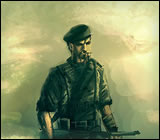
"Who is it doing this synthetic type of alpha beta psychedelic funkin'?"
Its a new sig I made for a Bundschuh character. I think some parts are really blurry, but it looks a whole lot better than the previous version I made in which the text was crystal clear. I didn't like the text being crystal clear however because the anti aliasing was really, really bad, so yeah, I figured blurring was better. Used both Photoshop and Fireworks to make it. Does anyone want me to upload the previous version for a comparison?
(By the way, the guy's name is Erich Eichmann in case anyone couldn't read it).
Don't know, though it looks blurry, it also has an "old" Touch. Maybe adding a little bit of Film Grain or Noise will make it look even better. Also, the Quotes make it sound like from a cheap Movie about Revenge xD
"Who is it doing this synthetic type of alpha beta psychedelic funkin'?"
Its a new sig I made for a Bundschuh character. I think some parts are really blurry, but it looks a whole lot better than the previous version I made in which the text was crystal clear. I didn't like the text being crystal clear however because the anti aliasing was really, really bad, so yeah, I figured blurring was better. Used both Photoshop and Fireworks to make it. Does anyone want me to upload the previous version for a comparison?
(By the way, the guy's name is Erich Eichmann in case anyone couldn't read it).
Too heavy on contrasts. It feels like the picture is in a rather low quality - you should save in png, might resolve some problem... I'm not sure what filter you used, but the result came back funny.
' Wrote:Don't know, though it looks blurry, it also has an "old" Touch. Maybe adding a little bit of Film Grain or Noise will make it look even better. Also, the Quotes make it sound like from a cheap Movie about Revenge xD
Added in the grain and noise. I personally think it looks waaayyy to blurry now, can barely read anything or recognize his face :/
' Wrote:Too heavy on contrasts. It feels like the picture is in a rather low quality - you should save in png, might resolve some problem... I'm not sure what filter you used, but the result came back funny.
This is the previous higher quality version, before I added in my custom grain effect. Personally I think everything is too sharp and the different parts don't really seem to blend in with each other
Anyways thanks for the feedback! Keep 'em rolling.


![[Image: Khelric-1-1.png]](http://i768.photobucket.com/albums/xx328/schlurbii/Signatures/Khelric-1-1.png)
![[Image: Newgoldensigfinishawesomecoolcolours.png]](http://i768.photobucket.com/albums/xx328/schlurbii/Signatures/Newgoldensigfinishawesomecoolcolours.png)
![[Image: mariussig3.png]](http://img534.imageshack.us/img534/6685/mariussig3.png)
![[Image: venica3.png]](http://img44.imageshack.us/img44/8712/venica3.png)

![[Image: oms1.png]](http://img18.imageshack.us/img18/1616/oms1.png)
![[Image: R8pppB2.png]](http://i.imgur.com/R8pppB2.png)

![[Image: Pirate-Ship.gif]](http://i1029.photobucket.com/albums/y358/GiullianoBarbarossa/Decorated%20images/Pirate-Ship.gif)

![[Image: PrincessSignaturecopy.png]](http://i930.photobucket.com/albums/ad144/Korolia/Gallia/PrincessSignaturecopy.png)
![[Image: finalfeedback.jpg]](http://img229.imageshack.us/img229/107/finalfeedback.jpg)
![[Image: finalfeedbackschlurbz.png]](http://img269.imageshack.us/img269/9603/finalfeedbackschlurbz.png)
![[Image: highqual.png]](http://img143.imageshack.us/img143/2070/highqual.png)