• Home
  • Index
  • Search
  • Download
  • Server Rules
  • House Roleplay Laws
  • Player Utilities
  • Player Help
  • Forum Utilities
  • Returning Player?
  • Toggle Sidebar
Interactive Nav-Map
Tutorials
New Wiki
ID reference
Restart reference
Players Online
Player Activity
Faction Activity
Player Base Status
Discord Help Channel
DarkStat
Server public configs
POB Administration
Missing Powerplant
Stuck in Connecticut
Account Banned
Lost Ship/Account
POB Restoration
Disconnected
Member List
Forum Stats
Show Team
View New Posts
View Today's Posts
Calendar
Help
Archive Mode


Hi there Guest,  
Existing user?   Sign in    Create account
Login
Username:
Password: Lost Password?
 
  Discovery Gaming Community The Community Media Center
« Previous 1 … 186 187 188 189 190 … 216 Next »
Logo for Dublin race

Server Time (24h)

Players Online

Active Events - Scoreboard

Latest activity

Pages (4): « Previous 1 2 3 4 Next »
Logo for Dublin race
Offline Banza
02-01-2009, 08:09 PM,
#11
Member
Posts: 356
Threads: 27
Joined: Oct 2007

@swift and many others: Propper name was "Tau 31 plague" -or uber power trade route between Harris planet and battleship McDuff orbiting the planet. Back in...I am not sure..4.83 mod. You could earn 80 millions in 1 hour. I spent many hours there(300 register hours). And made my fortune. Evry day 4 hours or more of...powertradeing...and lissening music, and here we are. But, I cant spent all that money by only spending on making chars. So, I made decission to spent 6 billions on race, and keep 2 just in case of alien atack.
@teschy: just like Coriko said, little movment would be nice.
@entrepreneur: All good, but background isnt Dublin one;)Yea,I notice:P
(*Whispers* And I hate current Greyhound design:P)
  Reply  
Offline Captain
02-01-2009, 08:25 PM,
#12
Bowex
Posts: 2,177
Threads: 95
Joined: Jan 2008

how about this one [Image: eind2wd8.png]

[Image: R8pppB2.png]
  Reply  
Offline Internity
02-01-2009, 09:01 PM, (This post was last modified: 02-03-2009, 08:17 PM by Internity.)
#13
Member
Posts: 726
Threads: 12
Joined: Feb 2008

I did something too, well can be used as a signature too.

[Image: 6400byRScopy.jpg]


*EDITED*


Send credits to: =LSF=Internity

LNS Ithaca
Reply  
Offline teschy
02-01-2009, 09:16 PM,
#14
20yrs & I Only Got This Title
Posts: 2,471
Threads: 24
Joined: Jan 2007

Some motion, if you will.

[Image: Dubrace4copy.png]
Reply  
Offline Etaphreven
02-01-2009, 09:21 PM, (This post was last modified: 02-01-2009, 09:48 PM by Etaphreven.)
#15
Member
Posts: 2,773
Threads: 37
Joined: Sep 2007

' Wrote:Some motion, if you will.

[Image: Dubrace4copy.png]

That.

10char

EDIT: Also, this lame one:

[Image: dublin6400.png]
Reply  
Offline ioha
02-02-2009, 01:20 PM,
#16
Member
Posts: 967
Threads: 16
Joined: Oct 2007

Blodo's is great as a logo, especially as I see the Arrow as the racing ship.
(Also, it was my love on first sight in Disco.)

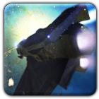
Teschy's is nice, though the motion blur shouldn't be in front (a.k.a. left) of the wings and the nose, as the ship is supposed to move forward (not backwards and forward...).
Take away that portion of the blur, add a tad of contrast to the Dagger, synch the ship's colour with the background (a Dagger won't look like that in Dublin, due to the Golden Sun) and maybe stretch it a little (I somehow think the Dagger was 'longer').

I'll see if I can come up with something as well. Probably not due to lack of time though...

[Image: GhostSleip.png]

Sebastian Goldig | Carlos "Coyote" Wells | Joshua Cooper
Colony News Service | Bretonian Royal Court | Characters & Biographies | Signatures & Designs
  Reply  
Offline teschy
02-02-2009, 03:42 PM, (This post was last modified: 02-02-2009, 03:50 PM by teschy.)
#17
20yrs & I Only Got This Title
Posts: 2,471
Threads: 24
Joined: Jan 2007

Can't really stretch that thing... it's only the angle that gives you the impression that the ship's nose is shorter than it's supposed to.

[Image: Dubrace6copy.png]
Reply  
Offline ioha
02-02-2009, 07:32 PM,
#18
Member
Posts: 967
Threads: 16
Joined: Oct 2007

' Wrote:Can't really stretch that thing... it's only the angle that gives you the impression that the ship's nose is shorter than it's supposed to.
Ah, nevermind then.

Anyways, now your logo is epic win:laugh:

[Image: GhostSleip.png]

Sebastian Goldig | Carlos "Coyote" Wells | Joshua Cooper
Colony News Service | Bretonian Royal Court | Characters & Biographies | Signatures & Designs
  Reply  
Offline Desiderium
02-02-2009, 10:13 PM, (This post was last modified: 02-03-2009, 12:07 AM by Desiderium.)
#19
Member
Posts: 30
Threads: 3
Joined: Feb 2009

Here's what I got up so far...
I tried to give the "Hyper Racer" feel to the Arrow ship. The engine effects came out well, I think...

Tell me what needs to be changed/added/taken out... Or if you like it or not.
Enjoy =)

Oh and thanks to "tazuras" who pointed me to this thread. =)

[Image: 9ay3yt.png]

"Exploration is really the essence of the human spirit."
Frank Borman
Reply  
Offline tazuras
02-03-2009, 07:07 AM, (This post was last modified: 02-03-2009, 07:09 AM by tazuras.)
#20
Member
Posts: 2,179
Threads: 69
Joined: Feb 2008

Shoot, maybe I shouldn't have told you, now I won't be able to get any work and Orin (another designer) might be pissed at me. If you can't tell, I like it, I'd love to know how you did that motion blur effect.

Some minor points:

I don't like the orange in the border that goes over the planet, I realize that's probably part of the effect but I think i might like a consistent border better (all blue).

The lighting on the top of the ship doesn't feel quite right, the top is in shadow where it seems like it would be in full light.

I like the monochrome idea for the ship but a little color might be nice, maybe a logo or the words "Dublin 6400" if you dont think coloring the hull pr cockpit would work.

I'm not a big fan of the small font, it's too much like Star Wars font and not enough like the font above it, maybe if you increased the letter spacing and increased the vertical height of the letters.

Those are the only things that bug me, other than that I think it's pretty perfect. I also want to say that I am being hypercritical here, it's pretty great as it is and most of these comments are somewhat subjective.

[Image: l2gnAQh.png]
Reply  
Pages (4): « Previous 1 2 3 4 Next »


  • View a Printable Version
  • Subscribe to this thread


Users browsing this thread:
1 Guest(s)


Powered By MyBB, © 2002-2025 MyBB Group. Theme © 2014 iAndrew & DiscoveryGC
  • Contact Us
  •  Lite mode
Linear Mode
Threaded Mode