• Home
  • Index
  • Search
  • Download
  • Server Rules
  • House Roleplay Laws
  • Player Utilities
  • Player Help
  • Forum Utilities
  • Returning Player?
  • Toggle Sidebar
Interactive Nav-Map
Tutorials
New Wiki
ID reference
Restart reference
Players Online
Player Activity
Faction Activity
Player Base Status
Discord Help Channel
DarkStat
Server public configs
POB Administration
Missing Powerplant
Stuck in Connecticut
Account Banned
Lost Ship/Account
POB Restoration
Disconnected
Member List
Forum Stats
Show Team
View New Posts
View Today's Posts
Calendar
Help
Archive Mode


Hi there Guest,  
Existing user?   Sign in    Create account
Login
Username:
Password: Lost Password?
 
  Discovery Gaming Community The Community Media Center
1 2 3 4 5 … 216 Next »
Signatures/Pictures/Avatars

Server Time (24h)

Players Online

Active Events - Scoreboard

Latest activity

Pages (897): « Previous 1 … 486 487 488 489 490 … 897 Next »
Signatures/Pictures/Avatars
Offline Simo
03-05-2010, 08:37 PM,
#4,871
Member
Posts: 119
Threads: 6
Joined: Dec 2008

Here is my latest, although its not fl related, i think it came out pretty nice:

[Image: alien2.png]

[Image: walkerbanner.png]
[Image: simosuserbarshop.png]
  Reply  
Offline Prysin
03-05-2010, 08:42 PM,
#4,872
Apex Predator
Posts: 3,099
Threads: 165
Joined: Jul 2009

@Simo

its decently good blending, you need to work a bit more on the overall style. Try not just make the background for the render or vice versa. Try blend it, use effects and lighting to create flow, depht and most importantly, LIFE!

overall, id give it a 7/10 though. Its good lightning and color use, text could be better though

[Image: v1zVWKX.png]
DHC Discord
Reply  
Offline Simo
03-05-2010, 08:46 PM, (This post was last modified: 03-05-2010, 08:47 PM by Simo.)
#4,873
Member
Posts: 119
Threads: 6
Joined: Dec 2008

thanks for the comment! and yeh, overall, most of my sigs have sucky text :/ i need to work on it more.

[Image: walkerbanner.png]
[Image: simosuserbarshop.png]
  Reply  
Offline Prysin
03-05-2010, 08:49 PM,
#4,874
Apex Predator
Posts: 3,099
Threads: 165
Joined: Jul 2009

oh, and i saw what you did there...

you used the render and used like "motion blur 500" "45 degrees"
then "gaussian blur" "5"

your background... isnt a background when you look at it. but it works

[Image: v1zVWKX.png]
DHC Discord
Reply  
Offline Simo
03-05-2010, 08:54 PM,
#4,875
Member
Posts: 119
Threads: 6
Joined: Dec 2008

I used the motion blur to create the background, using a ballpark and some brushing yes. Motion blurred the ballpark using different settings for 3 or 4 layers. So i think i get what you mean by its not a background becaue its not really blened with the render, but yea, it works

[Image: walkerbanner.png]
[Image: simosuserbarshop.png]
  Reply  
Offline frozen
03-05-2010, 08:58 PM,
#4,876
Member
Posts: 1,948
Threads: 76
Joined: Jul 2007

too big to use as a sig.

[Image: 5d1144bd1.png]
  Reply  
Offline Simo
03-05-2010, 09:02 PM,
#4,877
Member
Posts: 119
Threads: 6
Joined: Dec 2008

' Wrote:too big to use as a sig.


Not really, pretty much the same as DNICU's when you add up his sig + the sig bars.

[Image: walkerbanner.png]
[Image: simosuserbarshop.png]
  Reply  
Offline frozen
03-05-2010, 09:11 PM,
#4,878
Member
Posts: 1,948
Threads: 76
Joined: Jul 2007

his is still smaller than yours, yours is pretty much a square shape. and sooner or later you'll prolly get a mod asking you to either remove or resize it, fair warning.

regarding looks, its pretty neat. clean render of the alien which is nice, and the blueish theme blends well.

[Image: 5d1144bd1.png]
  Reply  
Offline Magoo!
03-05-2010, 09:25 PM, (This post was last modified: 03-05-2010, 09:30 PM by Magoo!.)
#4,879
Member
Posts: 1,875
Threads: 63
Joined: Sep 2007

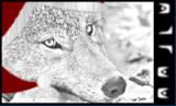
Super top-heavy for me, Simo. Makes the bottom a little hard for my eyes to concentrate on because the emphasis is the head. But Frozen is right, the max height allowed is 250, I believe.

Anyways, nobody has any replacement suggestions for the name?

P.S. New page?
-Edit- Yus... >.>

-Double Edit-
' Wrote:[Image: a4bcrl.png]

my latest creation.

what you think?
Resembles that failed Phantom sig I did a while ago.:PAnywho, I'd say max softness an eraser and make the clouds at the edges of the sig puff inward a bit. It'll look cloudier that way and have less smoke-in-cube effect.
  Reply  
Offline Simo
03-05-2010, 09:34 PM,
#4,880
Member
Posts: 119
Threads: 6
Joined: Dec 2008

' Wrote:his is still smaller than yours, yours is pretty much a square shape. and sooner or later you'll prolly get a mod asking you to either remove or resize it, fair warning.

regarding looks, its pretty neat. clean render of the alien which is nice, and the blueish theme blends well.

Meh, hoodlum just asked me, sorry

And yeh i see what you mean, imma make the render smaller so its not such a square shape, will look better than, oh and imma play with the text for a while

[Image: walkerbanner.png]
[Image: simosuserbarshop.png]
  Reply  
Pages (897): « Previous 1 … 486 487 488 489 490 … 897 Next »


  • View a Printable Version
  • Subscribe to this thread


Users browsing this thread:
12 Guest(s)


Powered By MyBB, © 2002-2025 MyBB Group. Theme © 2014 iAndrew & DiscoveryGC
  • Contact Us
  •  Lite mode
Linear Mode
Threaded Mode