So, a lot of CR|'s logos are outdated. We also changed our name from Colonial Republic to Crayter Republic, to match our lore and be less of what we used to be, way back in 2007 when the mod was something completely different (well, not completely). Anyway, we'd like to keep some of the gist of the old logo.
That is, the Phoenix part of it. Has to do with life loving to screw the CR over, again and again, but us always picking ourselves back up.
However, to incorporate the parts of our lore in which the majority (or at least a plurality) of our ancestry is Greek in origin, we also looked into the double-headed eagle, commonly used by the ERE/Byzantines (which, while admittedly Roman by legality, was culturally and linguistically mostly Greek). But to be original, we decided to step it up a notch further; a double headed Phoenix. Should be cool, if it turns out right.
Now, image artists, keep in mind that it's supposed to be a logo. Cool, yet relatively simple. Make it good, but not too flashy or complex.
Use our old logo and this double-headed eagle for inspiration on the animal (don't make the feet so big, though). Like in the old one, Crayter Republic should arch from the edge of the left wing over to the right. Something neat should go along the sides, and the overall shape should be a circle.
The image should have a main color, with the borders and text being black. There should be multiple versions of the logo, each with their own main color; gold, crimson, navy, gray, and pine.
CR|-Treasury will fund 200m for this logo
If you have any questions, ask away
Begin!
"You see what your knowledge tells you you're seeing. ... how, what you think the universe is, and how you react to that in everything you do, depends on what you know. And when that knowledge changes, for you, the universe changes. And that is as true for the whole of society as that is for the individual. We all are what we know, today. What we knew yesterday, was different; and so were we."
- James Burke, The Day the Universe Changed (1985)
So , here is my addition to this , not exactly the concept @Teerin showed me, but ...
Tried to keep the "feelng of the old CR logo, dunno if it worked out well.
Also, a bt of extra added for the Roman/Byzhantine orogin
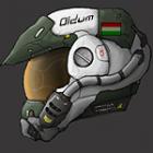
And since the tech style idea is taken, I took another approach
I'm open to suggestions, look at these as concepts that might need tweaking


![[Image: kIHP9wI.png]](http://i.imgur.com/kIHP9wI.png)


![[Image: Crayter-Republic1_zpsm4kyec1e.png]](http://i630.photobucket.com/albums/uu23/oldum/Freelancer%20Signs/Crayter%20Republic/Crayter-Republic1_zpsm4kyec1e.png)
![[Image: Crayter-Republic2_zpsiasygwzq.png]](http://i630.photobucket.com/albums/uu23/oldum/Freelancer%20Signs/Crayter%20Republic/Crayter-Republic2_zpsiasygwzq.png)

![[Image: Crayter-Republic3_zpshaayxsls.png]](http://i630.photobucket.com/albums/uu23/oldum/Freelancer%20Signs/Crayter%20Republic/Crayter-Republic3_zpshaayxsls.png)
![[Image: XNtEq5t.jpg]](http://i.imgur.com/XNtEq5t.jpg)
![[Image: Vxqj04i.gif]](https://i.imgur.com/Vxqj04i.gif)